Sage, clay, and cream are the colours of an English cottage, soft, earthy, drawn straight from the garden and the landscape outside. They're gentle and warm and, against stone and oak and brass, they feel timeless rather than trendy. Here's how to use this cottage palette so a room feels soft, warm, and collected.
Cream as the Backdrop
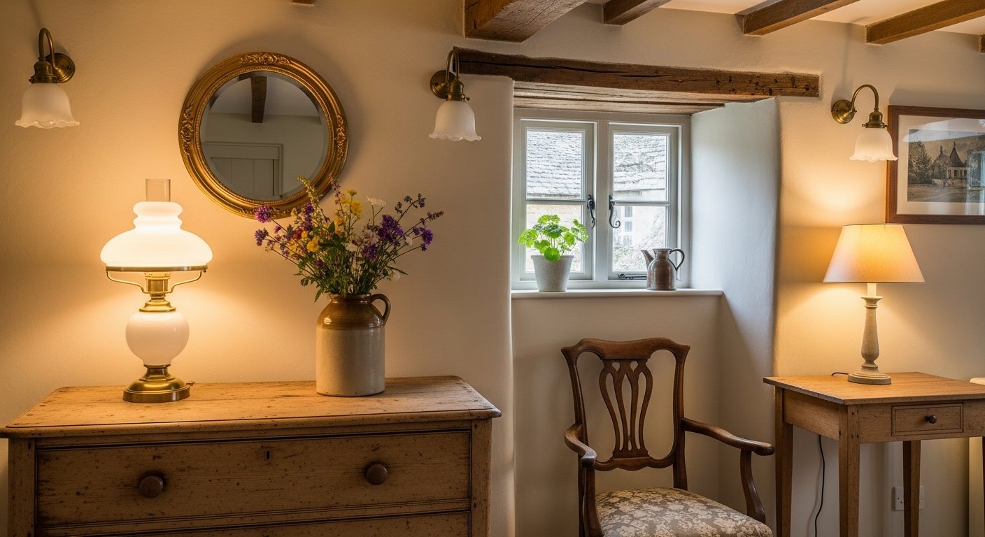
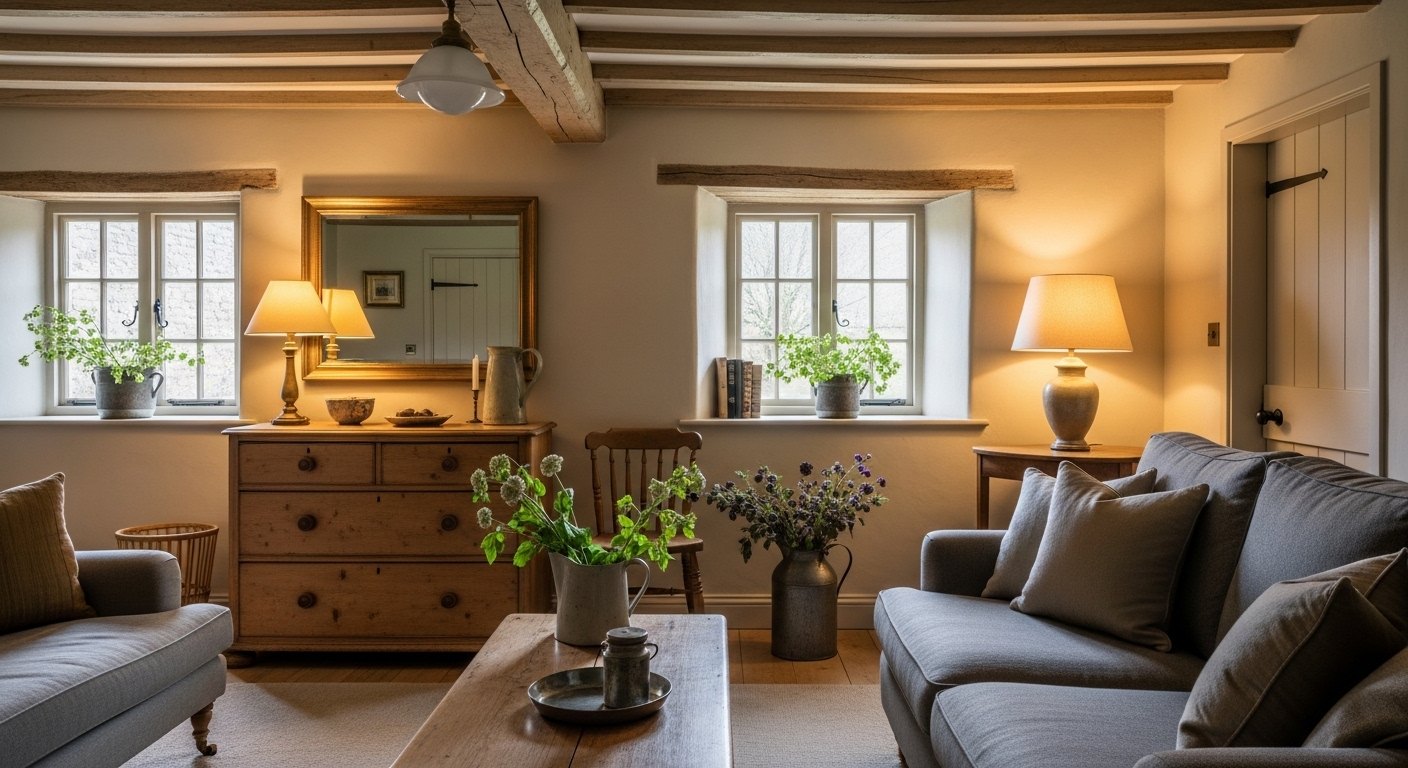
The foundation is warm cream and off-white, on the walls, lifting the dark low-beamed rooms and bouncing what daylight comes through the deep windows. A warm off-white backdrop lets the stone, beams, and brass shine and gives the softer colours something gentle to sit against. Avoid cool, stark whites, which feel wrong against warm old materials.
Sage, the Cottage Green
Sage and other muted greens are the quintessential cottage colour, echoing the foliage just outside the window. Soft and restful, sage suits painted cabinets, panelling, doors, and textiles, and it sits beautifully against cream and natural wood. It's the green of the garden brought gently indoors, calming, timeless, and unmistakably cottage.
Clay and Terracotta for Warmth
Warm clay and terracotta bring the earthy warmth that keeps a cottage from feeling cool. A clay-coloured cushion, a terracotta pot, a dusky-pink throw. These warm, earthy tones complement sage perfectly, the two echoing foliage and earth together. Used as accents against cream and sage, clay adds the cosy warmth that makes a room inviting.
Deeper Tones for Cosy Rooms
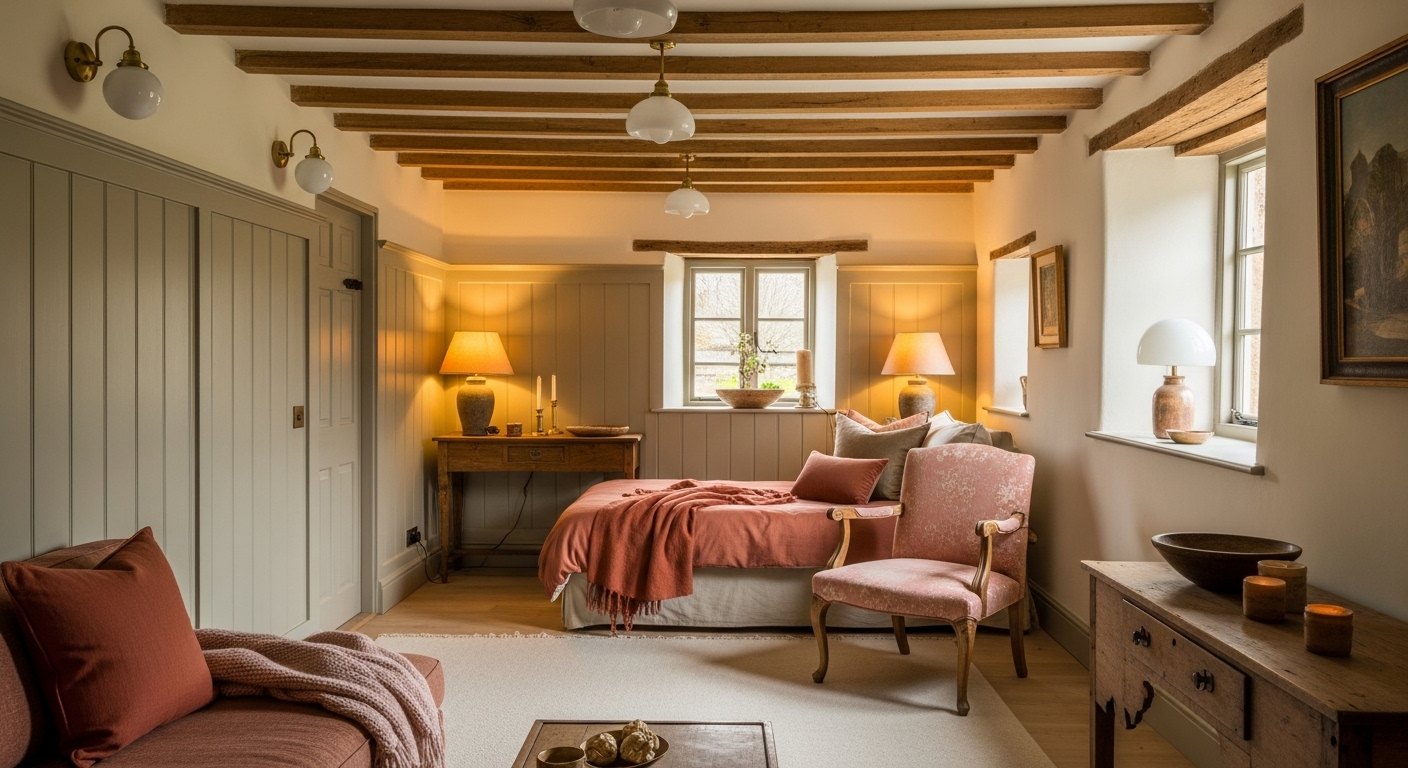
While the main rooms stay soft, a small or cosy room, a snug, a study, a downstairs loo, can take a deeper colour beautifully. A dark botanical green or a rich warm clay wraps a little room and makes it feel intimate, especially with warm lamplight. Be bold with colour where the room is small and meant to be cocooning, and keep the larger rooms soft.
Let the Materials Lead
A cottage palette is as much about materials as paint. The honey of the stone, the warm brown of the oak, the gold of the brass, the green of the plants. The painted colours should defer to these natural tones rather than fight them. Keep the palette soft and let the stone, wood, and greenery do as much work as the colour.
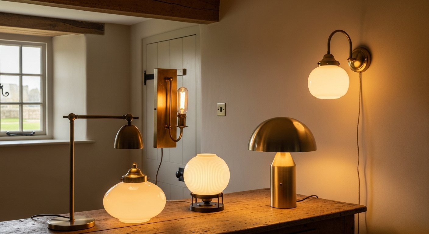
Warm Light Makes It Glow
These soft, earthy colours come alive under warm 2700K light and go muddy and grey under cool light. Warm lamplight makes sage glow, clay deepen, and cream turn golden; cool light flattens them all. As with everything in a cottage, the warm light is what ties the palette together, get the bulbs wrong and even the loveliest colours fall flat.
Timeless, Not Trendy
Sage, clay, and cream read as timeless rather than fashionable because they're drawn from nature and the landscape, the same colours cottages have worn for centuries. Anchored in natural materials and warm light, used softly with the odd deeper room for depth, this palette never dates. It's the gentle, earthy, garden-drawn colour story that makes an English cottage feel like itself.
Building a Cottage Colour Scheme
A cottage colour scheme leads with warm cream and off-white to lift dark rooms, adds sage green to echo the garden. And warms it with clay and terracotta accents, with deeper botanical greens or ochre for cosy rooms. These soft, nature-drawn colours sit beautifully against stone, oak, and brass, and a single deeper room like a snug gives the scheme depth without overwhelming the whole cottage.
Why Warm Light Makes the Palette Glow
Sage, clay, and cream come alive under warm 2700K light and go muddy under cool light. Warm lamplight makes sage glow, clay deepen, and cream turn golden; cool light flattens them all. As with everything in a cottage, the warm light is what ties the palette together, get the bulbs wrong and even the loveliest heritage colours fall flat.
Shop this post: the minimal home edit and wall sconces